A tunable, variable alternative to Poppins
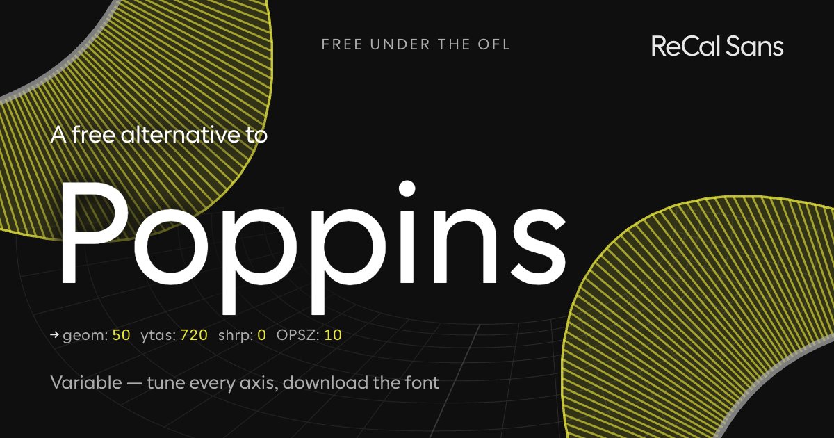
Poppins is a clean geometric sans with near-monolinear strokes and circular bowls — deservedly popular for friendly, modern UI, and free under the OFL. So a "free alternative" pitch would be meaningless. The honest comparison is about control: Poppins ships one optical treatment across every size, and its perfect circles can feel generic at text sizes.
ReCal Sans is built on Cal Sans, a variable font with a geometric axis (GEOM) and a real optical-size axis (opsz). Push GEOM up for the same circular, display-geometric feel; keep opsz honest so the same file reads well from body copy to billboards. Then bake your choices into a static file and ship it — no per-site font-variation-settings required.
Customize it above ↑The tell: what gives Poppins away
Poppins gives itself away with the single-storey a — a Futura-descended circle and stem — and with flat terminations cut perpendicular to the stroke through t, f and j. Cal Sans draws those flat cuts natively at its base, so this preset borrows them rather than imitating them, and takes the humanist 6 and 9 whose apostrophe-like terminals Poppins shares.
Where ReCal Sans loses
The honest loss is in the turned glyphs: the crunched centre spine of Poppins' S and s is not duplicated here, and it looks good where Poppins puts it. The honest win runs the other way. Poppins cuts every terminal at 90° to its stroke and square to the baseline; Cal Sans keeps the perpendicular cut but angles most terminals off the baseline to open the counterforms — which is what Poppins gives up at small sizes.
Will it drop into a Poppins layout?
Close stylistically, not a drop-in: the copyfit differs. WORDMARK builds metrically compatible versions on request — mark@wordmark.nyc.
At the same point size Poppins feels bigger — it carries more of its body above the baseline. Measured on the cap-height-normalized comparison, Poppins runs about 10% taller.
What this preset freezes
Baked into the font you download, named as CalSansVF declares them:
cv22— Geometric yss16— Humanist/Grotesk 6 and 9
Frequently asked
- Poppins is already free — why use ReCal Sans instead?
- Because of control, not cost. Poppins ships one drawing for every size — the same circles at 12px and at 120px, with no optical-size axis to reconcile them. ReCal Sans gives you a GEOM axis that runs from accessibility-optimized shapes to fully geometric ones, a real opsz axis, and an export that bakes your position on both into the file.
- How is ReCal Sans different from Poppins?
- Poppins is a fixed design that varies only in weight: its circles are the same circles at every size. ReCal Sans varies the shapes themselves — GEOM moves the letterforms between accessibility-optimized and geometric, opsz adjusts the drawing to the size it is set at, and the exported static file keeps whatever you chose.
- Can I use ReCal Sans commercially?
- Yes — the SIL Open Font License permits commercial use, embedding and modification. The font is yours to ship.