A tunable, variable alternative to Geist
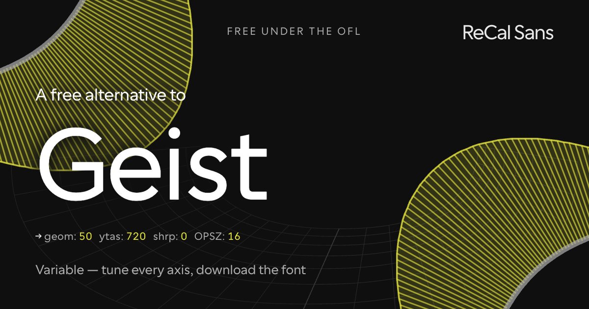
Geist is a crisp, Swiss-leaning developer sans — variable weight, tight spacing, free under the OFL. It nails one voice extremely well: the terminal-adjacent modernism of the platform it was drawn for. It also ships without italics and without optical sizing.
ReCal Sans covers that same clean-geometric ground at GEOM 50, then keeps going: a real optical-size axis so text sizes stay readable, an italic axis, ascender and sharpness controls, and glyph-swap thresholds you can move. Tune the file to your product, download it, ship it.
Customize it above ↑The tell: what gives Geist away
Geist follows Inter and adds spice: the tailed a, and flat terminations cut perpendicular to the stroke on t, f and j. This preset names both by their labels in the font — cv03, the accessible tailed a, and cv11, the humanist G — alongside the humanist 6 and 9.
Where ReCal Sans loses
The same terminal trade as Inter, plus one thing Cal Sans simply cannot do: Geist's dots are square, and there is no swap here that makes a round dot square. Beyond that, Geist cuts nearly every terminal square to the baseline where Cal Sans angles most of them to open the counters — gaining at small sizes what it gives up in evenness.
Will it drop into a Geist layout?
Close stylistically, not a drop-in: the copyfit differs. WORDMARK builds metrically compatible versions on request — mark@wordmark.nyc.
At the same point size Geist feels identical. Measured on the cap-height-normalized comparison, Geist runs about 4% taller.
What this preset freezes
Baked into the font you download, named as CalSansVF declares them:
cv03— Accessible/tailed acv11— Humanist Gss16— Humanist/Grotesk 6 and 9
Frequently asked
- Geist is already free — why use ReCal Sans instead?
- Because of range, not cost. Geist is drawn tight around developer tooling — one register, sized by you rather than by the font. ReCal Sans adds a real optical-size axis and a GEOM axis you set yourself, then bakes both into a static file you ship.
- How is ReCal Sans different from Geist?
- Geist ships as fixed families drawn for one register, with no optical-size axis to adapt them. ReCal Sans is a single variable file: GEOM re-draws the letterforms between accessibility-optimized and geometric, opsz keeps the drawing honest from body copy to headline, and you freeze your settings in before you ship.
- Can I use ReCal Sans commercially?
- Yes — the SIL Open Font License permits commercial use, embedding and modification. The font is yours to ship.