A free, tunable alternative to Neutra
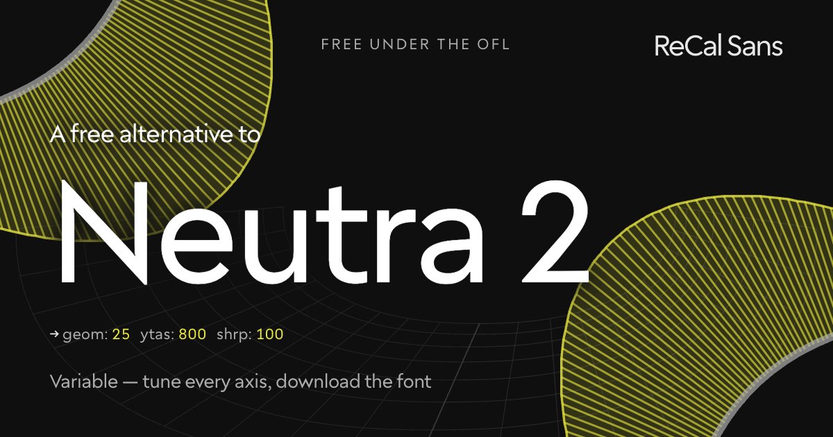
Neutra (and Neutraface after it) channels Richard Neutra’s mid-century architectural modernism: long elegant ascenders, low waists, flat sharp terminals — typography as signage. It is beautiful, distinctive, and commercially licensed.
ReCal Sans can be tuned into that architectural register: raise the ascender axis to 1600, push terminal sharpness to full, and keep the construction clean. The result is free (OFL), variable, and optically sized — and the exported file bakes your proportions in, no styling required at the call site.
Customize it above ↑The tell: what gives Neutra away
Drawn after Richard Neutra's building numbering and signage — an architect's lettering, amateur and auteur at once. Sharp corners in the Futura and Erbar line, and the shortest apparent x-height this designspace can reach, arrived at by pushing the ascenders tall rather than the x-height down. Humanist t, f and j, with the crossed t, spurless u and flat y.
Where ReCal Sans loses
This is the clearest loss of the eight. Cal Sans' x-height does not hold a candle to Neutra's tiny one, or to the proud, tall caps above it. The ascender axis reaches the proportion by a different route and does not fully arrive.
Will it drop into a Neutra layout?
Close stylistically, not a drop-in: the copyfit differs. WORDMARK builds metrically compatible versions on request — mark@wordmark.nyc.
At the same point size Neutra is smaller by a wide margin, which is the point of the design. Measured on the cap-height-normalized comparison, Neutra runs about 14% shorter.
What this preset freezes
Baked into the font you download, named as CalSansVF declares them:
cv02— Humanist acv22— Geometric y
Frequently asked
- Is there a free alternative to Neutra?
- Yes. ReCal Sans is free and open-source under the SIL Open Font License. Its ascender and terminal-sharpness axes reach the tall-extender, flat-cut architectural register Neutra is loved for, and you decide where to stop rather than picking a cut someone else stopped at. No per-seat license, no web tier.
- How is ReCal Sans different from Neutra?
- Neutra ships fixed, in the optical sizes its foundry chose to draw. ReCal Sans hands you those decisions as controls: ascender height, terminal sharpness, and a continuous optical-size axis — so you set the register instead of choosing between cut names.
- Can I use ReCal Sans commercially?
- Yes — the SIL Open Font License permits commercial use, embedding and modification. The font is yours to ship.