A free, tunable alternative to Futura
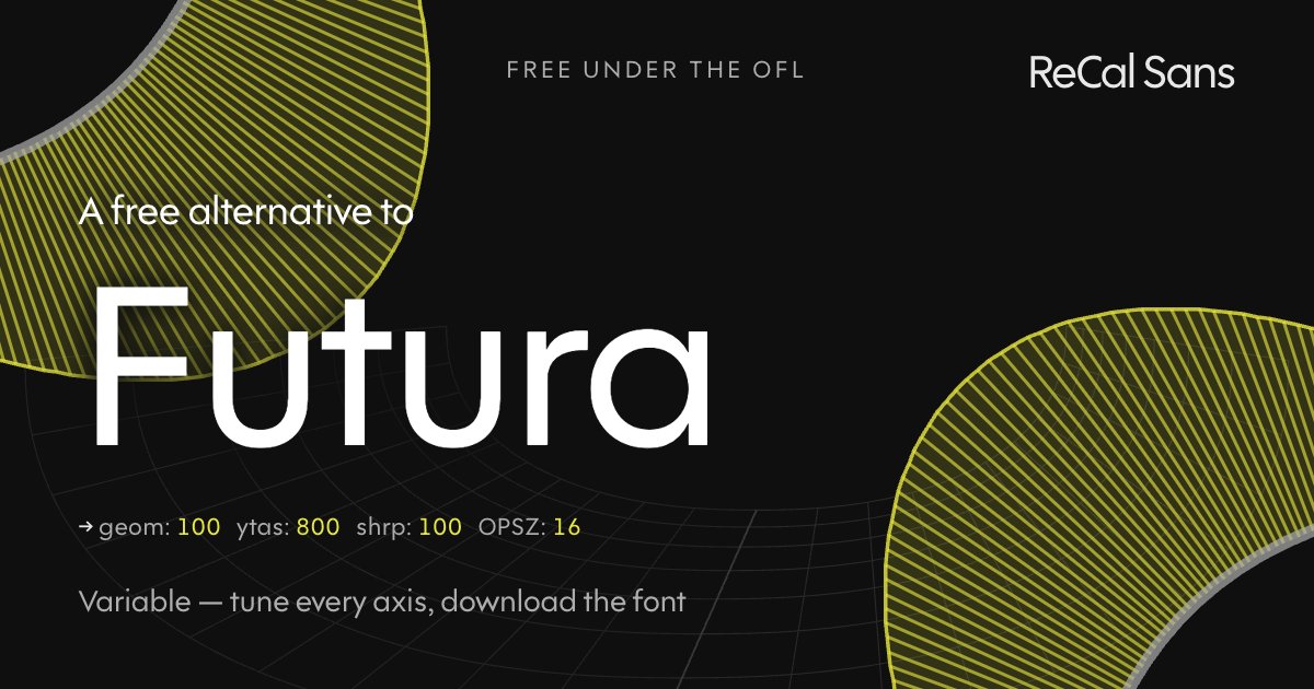
Futura is the geometric sans — Paul Renner’s 1927 circles-and-triangles modernism, with its pointed apexes, long ascenders, and single-story a. Nearly a century on it still reads as "the future," and it is still licensed commercially, weight by weight.
ReCal Sans at GEOM 100 goes fully geometric: circular bowls, sharpened terminals, and an ascender axis you can push to Futura’s classical proportions. Unlike a static Futura license, the file is free (OFL), variable, and optically sized — one download covers captions to display. Tune it, then bake your settings in.
Customize it above ↑The tell: what gives Futura away
The Bauhaus original, 1927 — the far bookend of the GEOM axis and the face an entire genre of geometrics descends from. It is also the one Cal Sans was drawn in argument with, and its designer's scruples about it are part of the project. Divisive and authoritative. Futura keeps humanist t, f and j rather than flat constructions, but takes the crossed t, the spurless u and the entirely flat y.
Where ReCal Sans loses
Cal Sans gets close here — closer than anywhere else on this list. What it does not have is Futura's trajanic proportion: the narrow R, A and S. Cal Sans pulled that punch, deliberately, and the difference shows most in caps.
Will it drop into a Futura layout?
Close stylistically, not a drop-in: the copyfit differs. WORDMARK builds metrically compatible versions on request — mark@wordmark.nyc.
At the same point size Futura feels smaller — the low x-height under those long extenders is the whole effect. Measured on the cap-height-normalized comparison, Futura runs about 13% shorter.
Frequently asked
- Is there a free alternative to Futura?
- Yes. ReCal Sans is free and open-source under the SIL Open Font License. Push GEOM to 100 and raise the ascender axis and you reach the circles-first construction and above-cap-height extenders Futura established in 1927 — plus an optical-size axis no metal-era design was ever drawn with. Tune it in the browser, download a static TTF, pay nothing.
- How is ReCal Sans different from Futura?
- Futura is a 1927 design distributed as static styles: what the foundry drew is what you set. ReCal Sans reaches the same geometric territory through axes instead — GEOM for the construction, an ascender axis for those characteristic tall extenders, terminal sharpness, and an optical-size axis the original never had.
- Can I use ReCal Sans commercially?
- Yes — the SIL Open Font License permits commercial use, embedding and modification. The font is yours to ship.