A free, tunable alternative to Gotham
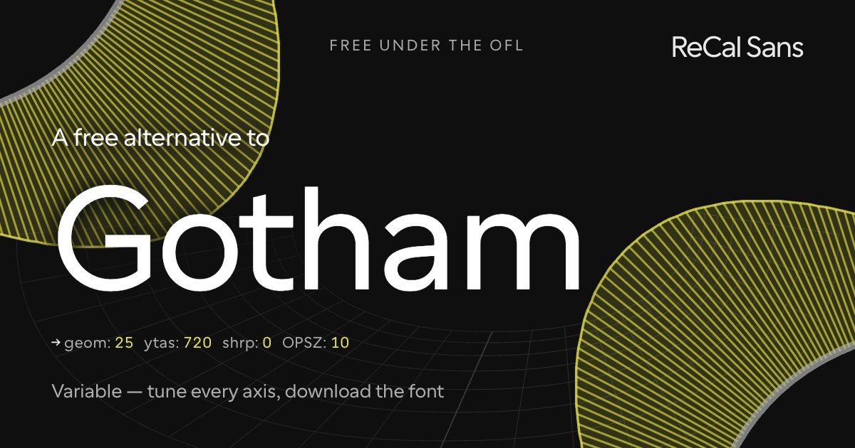
Gotham is a confident American geometric sans — even strokes, a tall x-height, and squared-off geometry drawn from mid-century signage. It set a tone for a decade of branding, and it is licensed accordingly.
ReCal Sans is free and open (OFL), built on the variable Cal Sans. Raise GEOM for the same upright, geometric construction and set a generous ascender; keep the optical-size axis honest so one file works from captions to headlines. Tune it, then download a static TTF — no license, no per-weight purchase.
Customize it above ↑The tell: what gives Gotham away
Drawn from real lettering: New York City signage, and the Port Authority Bus Terminal. The giveaway is the three-stroke capital G — one curve and two straight segments — which happens to be Cal Sans' default drawing. Humanist t, f and j, and the humanist 6 and 9.
Where ReCal Sans loses
The baseline curvature in n and o is masterful, with decades of Frere-Jones in it: the n's shoulder rides higher and further toward the top right than a plain arch, and the O carries two-unit flat sections at the midpoint of every piece — microscopic decisions that give the whole face a deliberate, disarming naivety. Cal Sans arrives twenty years later and is smoother and sleeker for it. That is a difference of intent, and Gotham's is the more considered drawing.
Will it drop into a Gotham layout?
Close stylistically, not a drop-in: the copyfit differs. WORDMARK builds metrically compatible versions on request — mark@wordmark.nyc.
At the same point size Gotham feels the same. Measured on the cap-height-normalized comparison, Gotham runs about 3.5% taller.
What this preset freezes
Baked into the font you download, named as CalSansVF declares them:
cv02— Humanist ass16— Humanist/Grotesk 6 and 9
Frequently asked
- Is there a free alternative to Gotham?
- Yes. ReCal Sans is free and open-source under the SIL Open Font License. Hold GEOM in the upright, even-stroked middle and freeze the optical size small, and you land near the confident American geometry Gotham made a branding default — in a file you own outright.
- How is ReCal Sans different from Gotham?
- Gotham ships as a large fixed family: you pick a cut, then a weight, and the drawing is settled. ReCal Sans ships as one variable file you tune — GEOM for the construction, a real optical-size axis for the size it will be used at — and freezes your choices into a static TTF on export.
- Can I use ReCal Sans commercially?
- Yes — the SIL Open Font License permits commercial use, embedding and modification. The font is yours to ship.