At WORDMARK, we design custom typefaces and logotypes that make brands consistent, clear, and unmistakable.
Marks we’ve made.

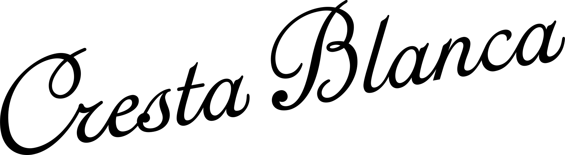





Brands tell unique stories with letters that fit.
Brands may share typefaces. None of them should sound alike. The difference is in the choices, the ones you can point to and the ones you only feel.
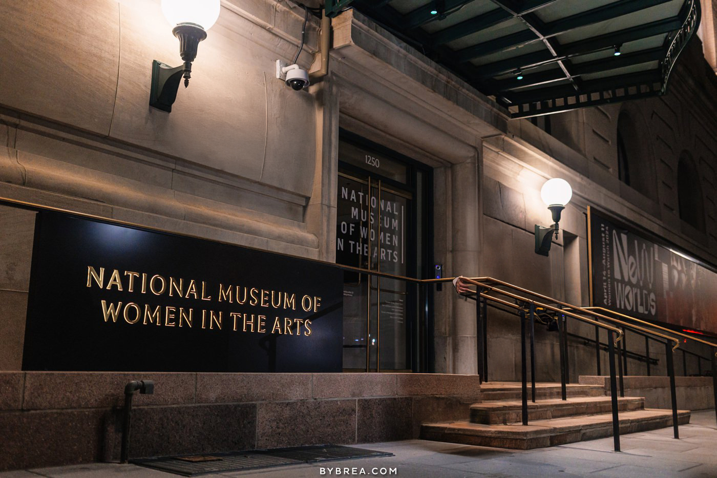
Typography for the National Museum of Women in the Arts’ remodel: illuminated signage, with creative direction by Sandrine Nugue Studio.
Get expert help with your mark, or start fresh. Work with people who live to make your letters sing.
The logotype is the most essential form of brand communication. It must work at six pixels and at sixty feet. We craft type meticulously by hand, adjusting letters and spacing until it looks like it was always there.
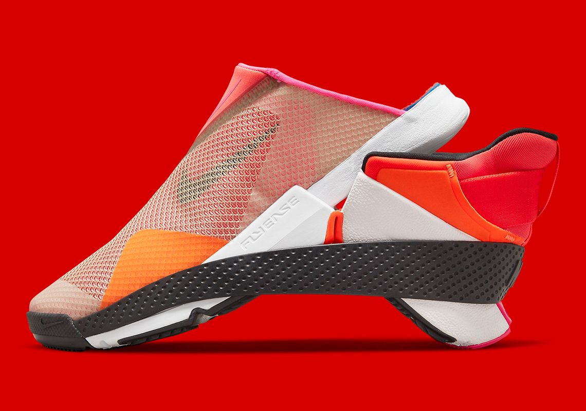
Logotype exploration and variable type engineering for the Nike FLYEASE wordmark, with Timothy Luke.
One font file. Every size, weight, and mood.
Variable fonts are the 30-year-old font format, rebuilt for every screen. We tune them by hand, axis by axis, so your type holds at any size.
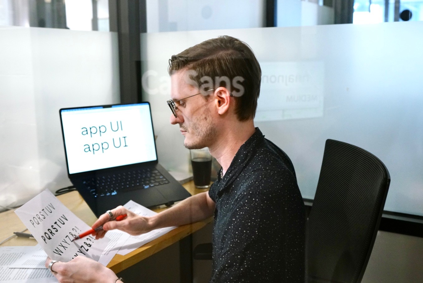
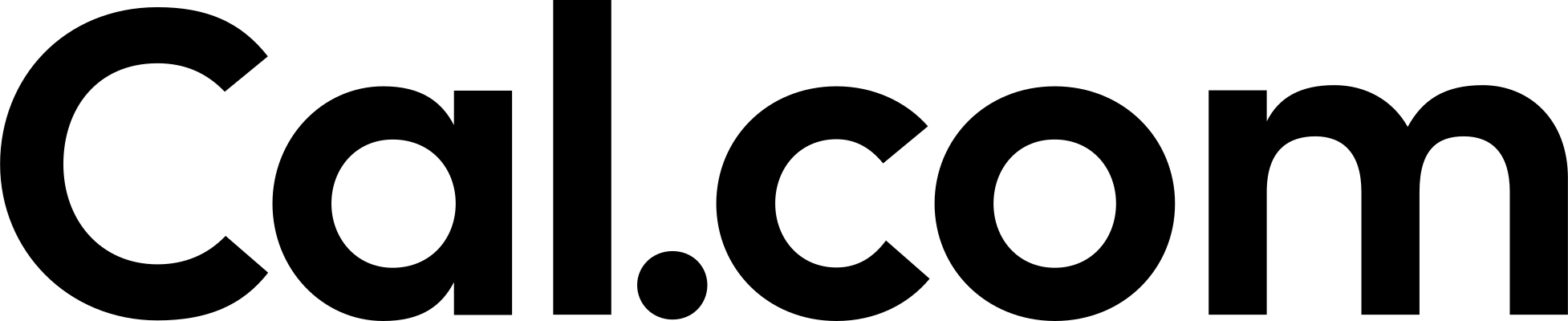
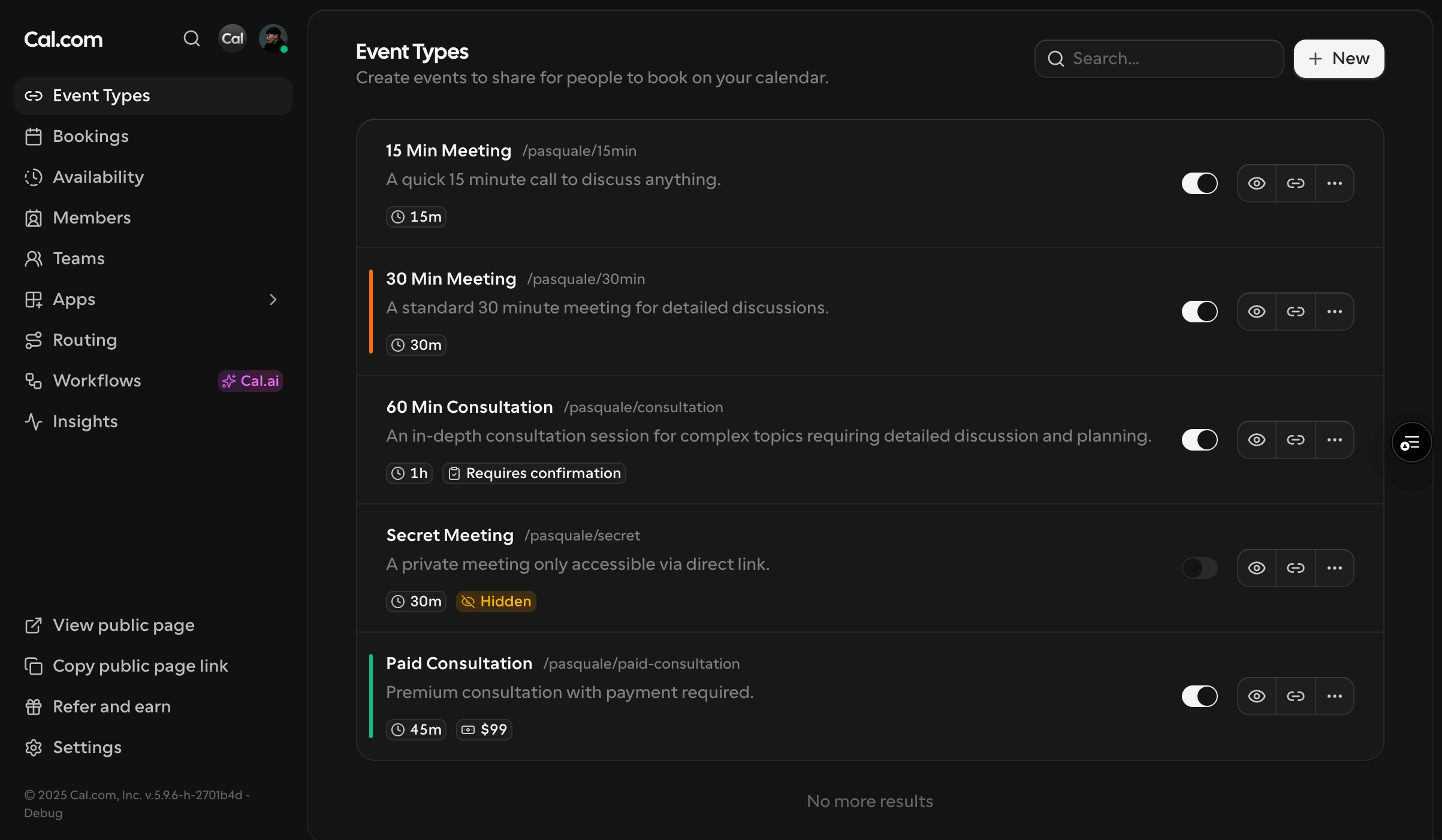
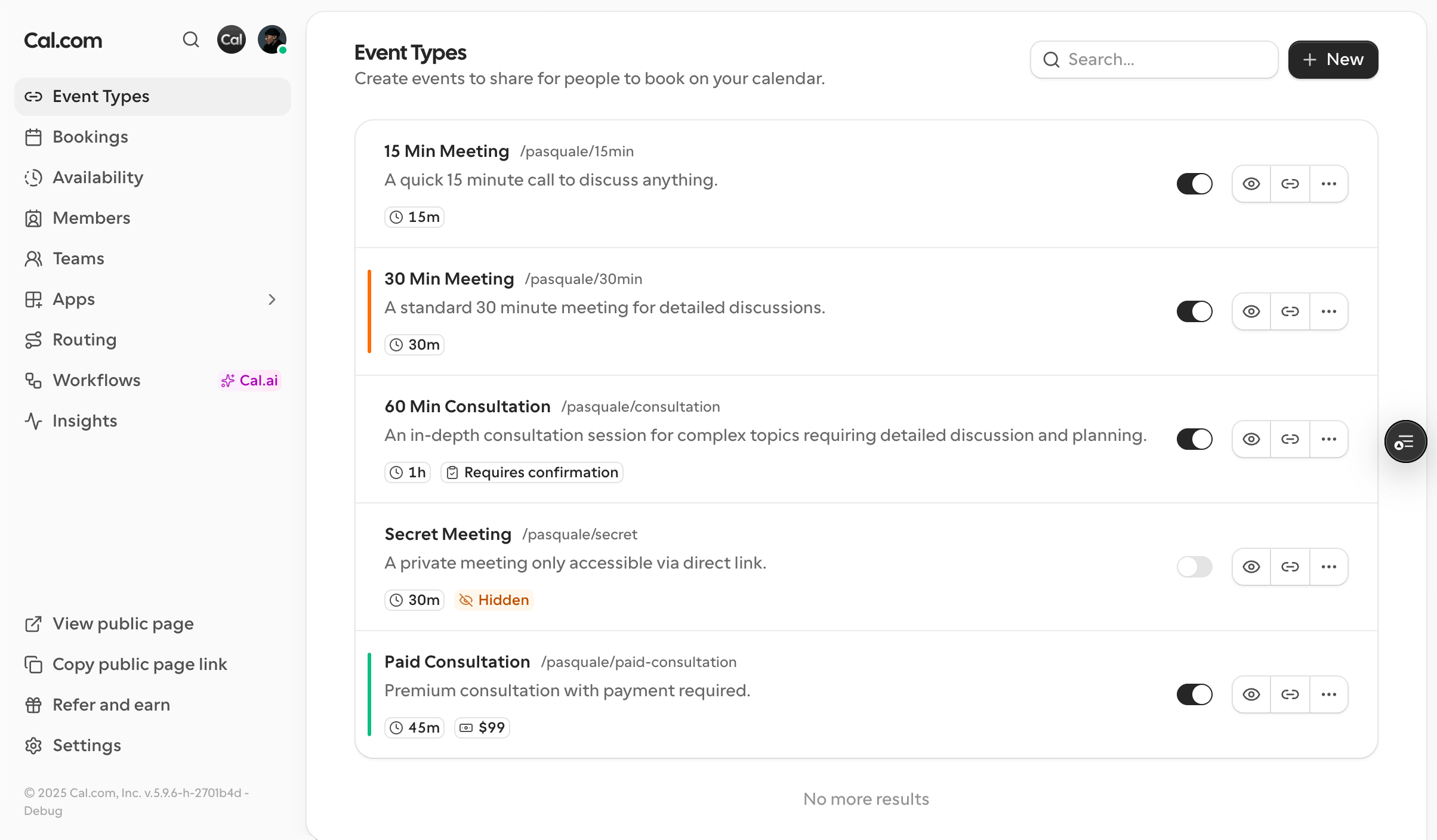
A bespoke replacement for open-source Inter, built inside Cal.com’s product and engineering teams: six variable axes tuned to their Tailwind type scale, so every heading and label speaks in one voice.
Consistency holds when the rules are explicit.
We audit how your type behaves across web, print, and motion, then write the guidelines that make the right choice the easy one. Even where your logo never appears.
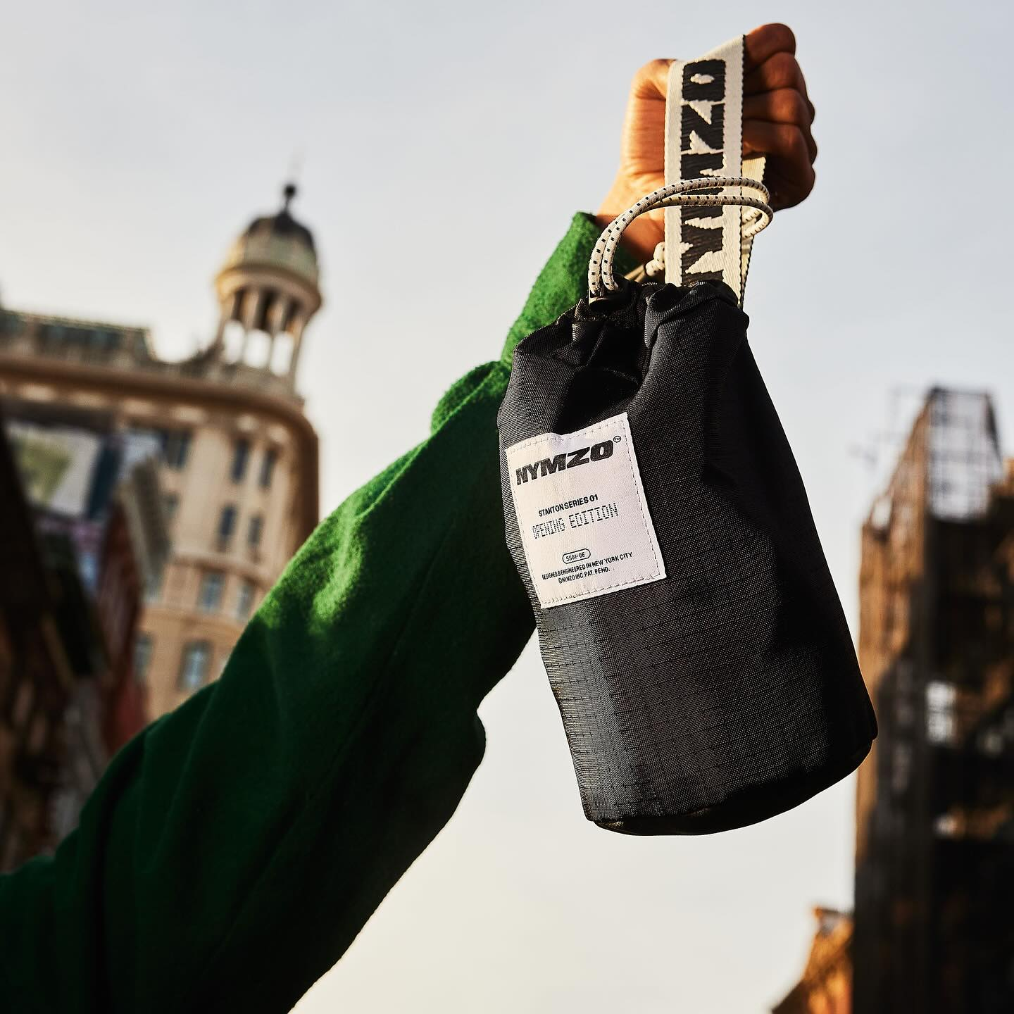
NYMZO is a challenger brand in luxury chess. Otherward brought in WORDMARK to take the logotype to global launch and product readiness.