Under one roof. Matter and Inter once shared the homepage with Cal Sans. Now the font pairing is Cal Sans with Cal Sans Text: one family, drawn by WORDMARK.
Cal Sans The family Cal.com keeps
Across five years and three fundamental shifts, WORDMARK made Cal.com’s logo and united its brand.
In the same span Cal.com raised $32M.
In 2021 Cal.com had no typographic DNA of its own, from logo to website to marketing. One weight proved a custom face could supplant a standard; the brand grew the rest.
Get the highlights
Day one: Cal.com reads as rings, in every weight. Peer’s 2021 brief, kept in every weight since.
Six axes, one file, added as Cal.com grew. Cal Sans 1 in 2021. Cal Sans UI 1.6 with weight and geometry in 2025. Cal Sans 2 with the rest in 2026.
1.4M views, 12.6K bookmarks. A million of them from posts Cal.com never wrote. 285 posts counted, 187 of them by other people.
Take a closer look
Spaced tight but never touching, so a headline composes straight out of the box. No kerning pass on the page, at 2.6× tighter than comparable fonts.
Scheduling infrastructure for everyone.
000 tracking.Out of the box.
Type over it.
An optical size axis from 8 to 45 hands each size its own drawing. Text opens up, headlines tighten, nobody switches fonts.
One font filefont-optical-sizing: auto
Default reads like SF Pro, Inter, or Helvetica. Tailed I, l, and 1 are one switch away when a link must read right.
ss18
Twenty stylistic sets and 42 character variants, with Futura alternates and historical ligatures one setting away. Room to pivot later.
Cal Sans Flex · GEOM 25 · SHRP 0
A billion meetings by 2030 means hellos from everywhere. Latin coverage beyond 400 languages sets each one as evenly as the brand’s own.
- HalloAfrikaans
- SalamAzerbaijani
- ZdravoBosnian
- KumustaCebuano
- BokCroatian
- HelloEnglish
- Góðan dagFaroese
- BonjourFrench
- Oli otyaGanda
- AlohaHawaiian
- SalutoIdo
- SaluteInterlingua
- KasumayJola-Fonyi
- ChamgeiKalenjin
- LabasLithuanian
- MisawaLuo
- HeloMalay
- Kia oraMāori
- Shé:konMohawk
- SalibonaniNorth Ndebele
- HeiNorwegian Bokmål
- AgandiNyankole
- CześćPolish
- BunăRomanian
- TālofaSamoan
- ZdravoSerbian
- AhojSlovak
- LotjhaniSouth Ndebele
- SampurasunSundanese
- HejSwedish
- AvuxeniTsonga
- SalamTurkmen
- Xin chàoVietnamese
- QeyWolastoqey
- SawubonaZulu
- PërshëndetjeAlbanian
- KaixoBasque
- DematBreton
- Dydh daCornish
- AhojCzech
- SalutonEsperanto
- KumustaFilipino
- MandiFriulian
- HalloGerman
- SziaHungarian
- NdewoIgbo
- Dia duitIrish
- OláKabuverdianu
- MurahoKinyarwanda
- coiLojban
- MoienLuxembourgish
- BonġuMaltese
- Mari mariMapuche
- BonzourMorisyen
- BuresNorth Sámi
- God dagNorwegian Nynorsk
- BonjornOccitan
- OláPortuguese
- AllegraRomansh
- SaludiSardinian
- MhoroShona
- ŽivjoSlovenian
- DumelaSouthern Sotho
- JamboSwahili
- GrüeziSwiss German
- DumelaTswana
- Dobry dźeńUpper Sorbian
- BondjoûWalloon
- Nanga defWolof
- HolaAsturian
- Muli shaniBemba
- HolaCatalan
- BonghjornuCorsican
- HejDanish
- TereEstonian
- HeiFinnish
- OlaGalician
- BonjouHaitian Creole
- HallóIcelandic
- HaloIndonesian
- CiaoItalian
- AluuKalaallisut
- SveikiLatvian
- Dobry źeńLower Sorbian
- SalamaMalagasy
- Moghrey mieManx
- IọkweMarshallese
- HensciMvskoke
- ThobelaNorthern Sotho
- MoniNyanja
- AkkamOromo
- AllillanchuQuechua
- AmahoroRundi
- HalòScottish Gaelic
- SalutamuSicilian
- SalaanSomali
- HolaSpanish
- SawubonaSwati
- Mālō e leleiTongan
- MerhabaTurkish
- SalomUzbek
- ShwmaeWelsh
- MoloXhosa
Hello, 103 waysCredit to Google Fonts’ shaperglot
At interface sizes, optical size redraws the proportions for product screens. GEOM swaps the geometric alternates in or out, glyph by glyph.
By the numbers
6variable axes
414languages
1,546glyphs
13,362Glyphs layers
402,680kern pairs
1.6kGitHub stars
How it came to be
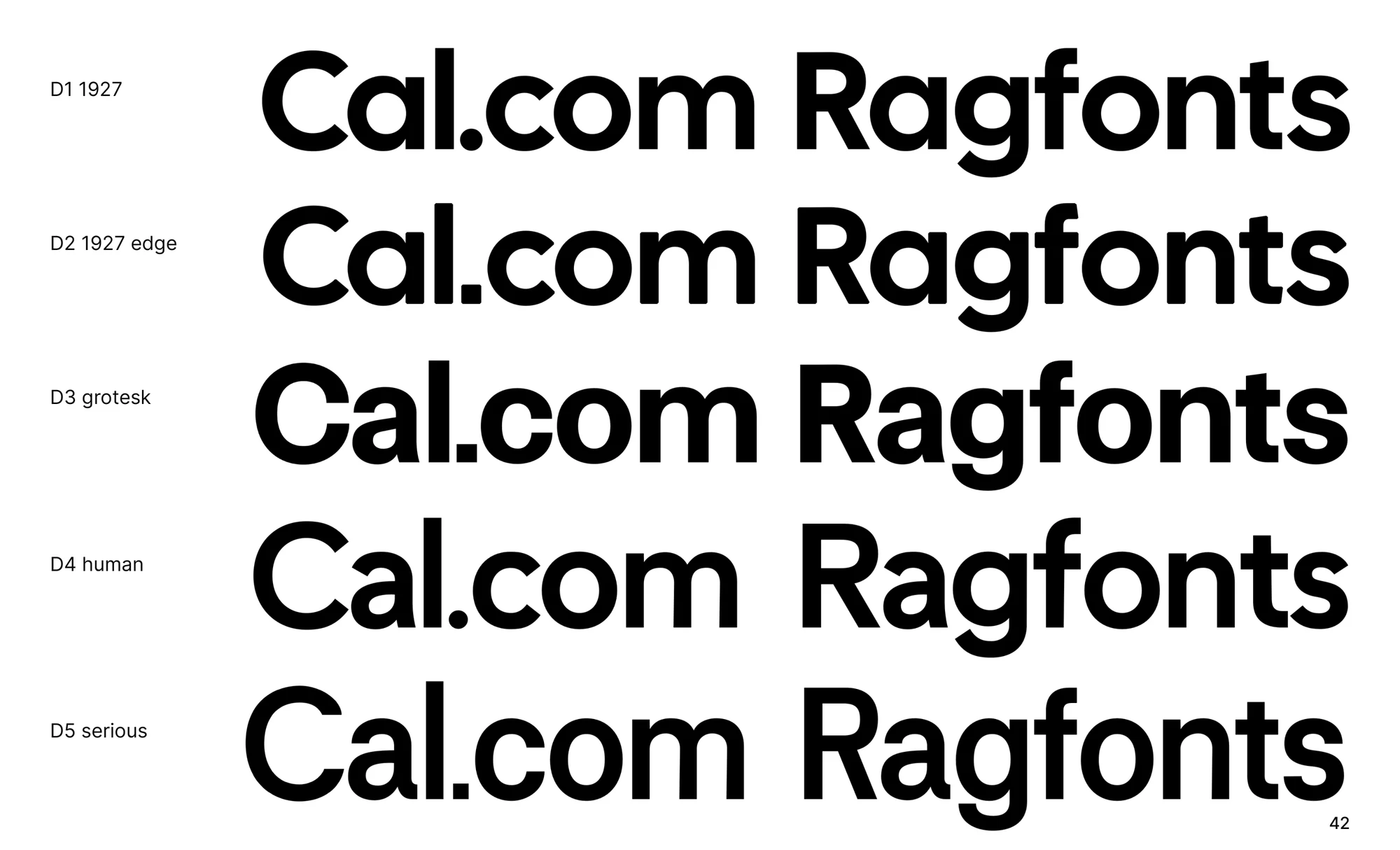
Five directions, one deck.
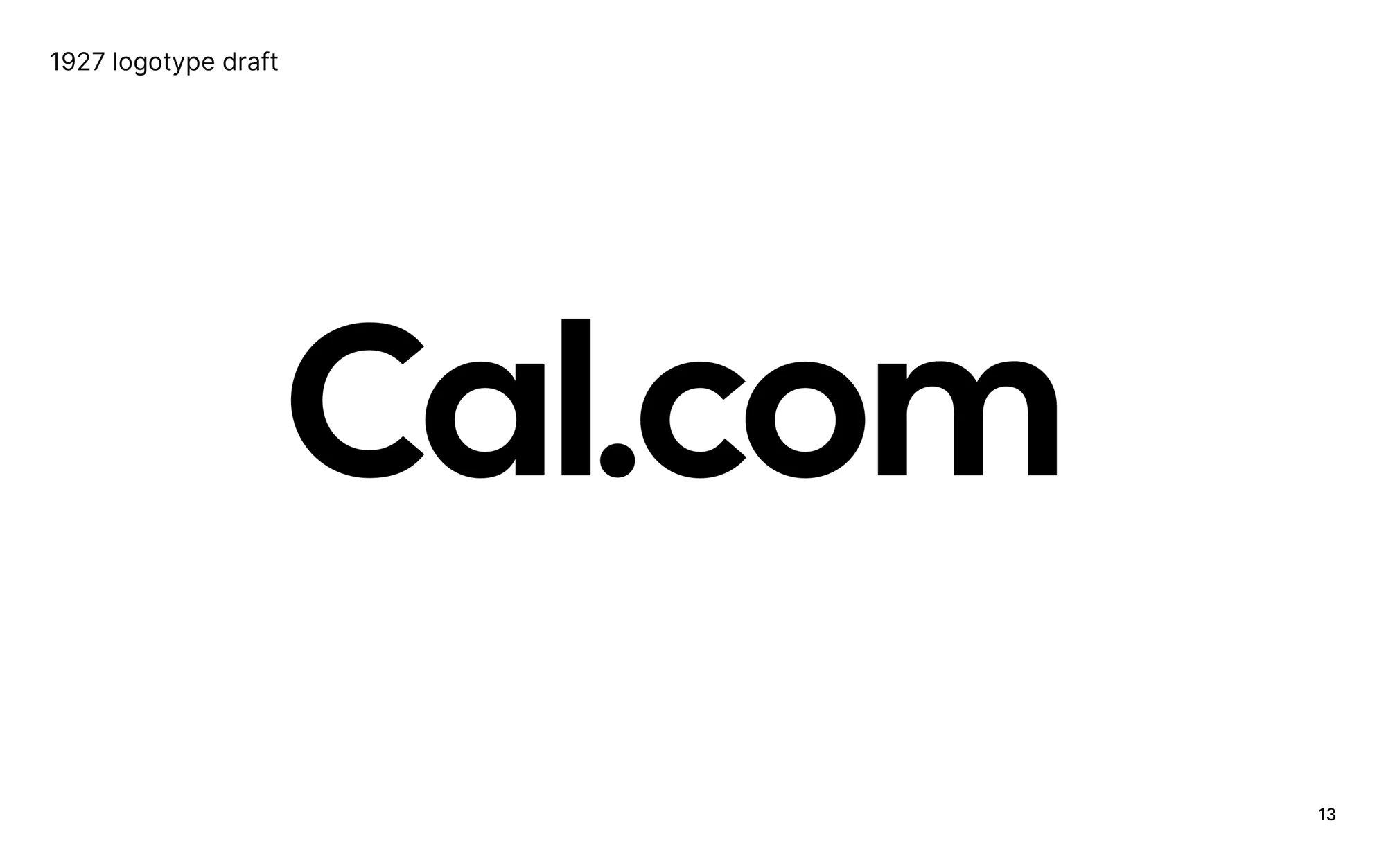
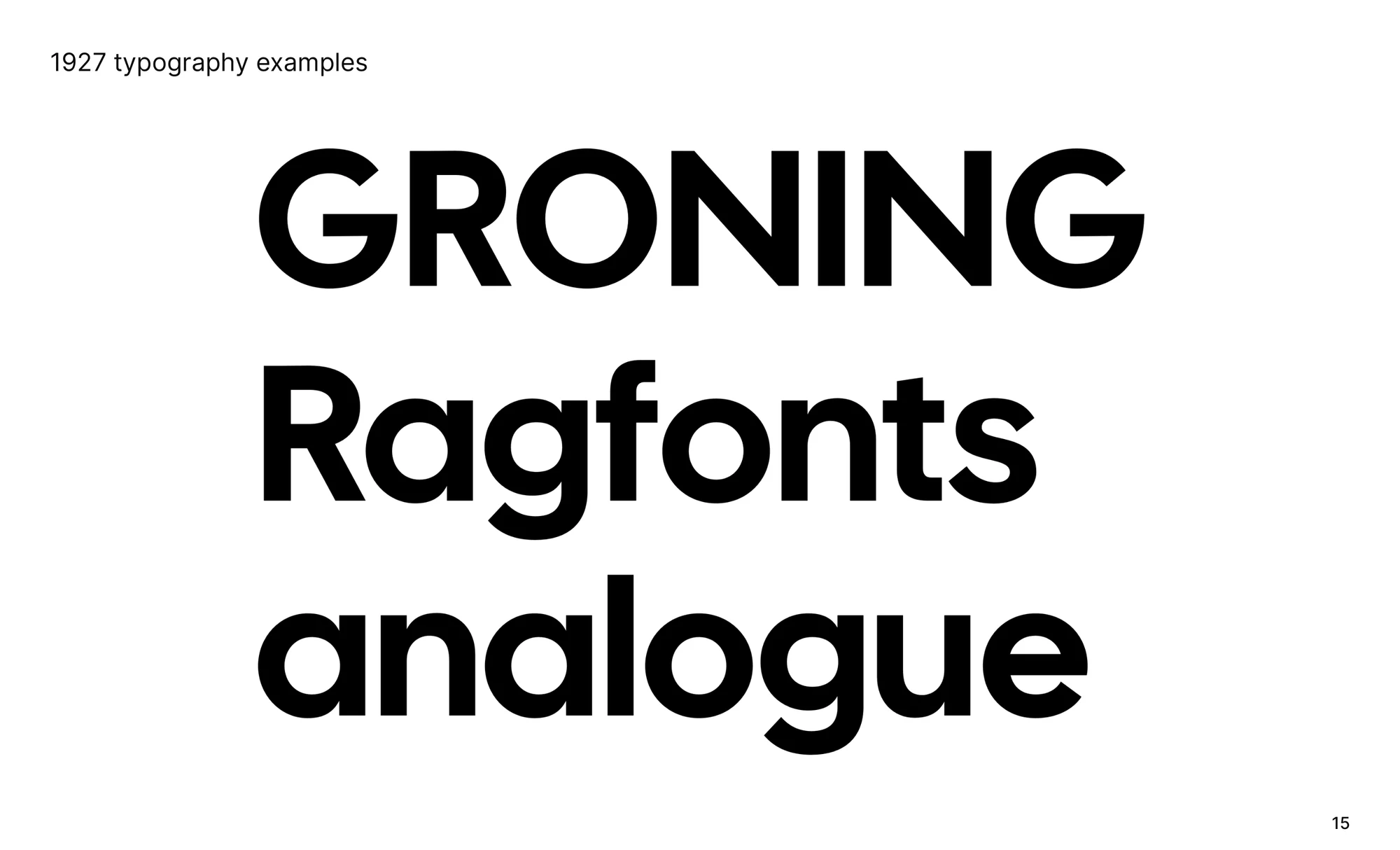
The first presentation in 2021 set five ways to draw Cal.com. Direction 1, 1927, became the logo and the display face. Direction 4, human, was the text face in waiting.
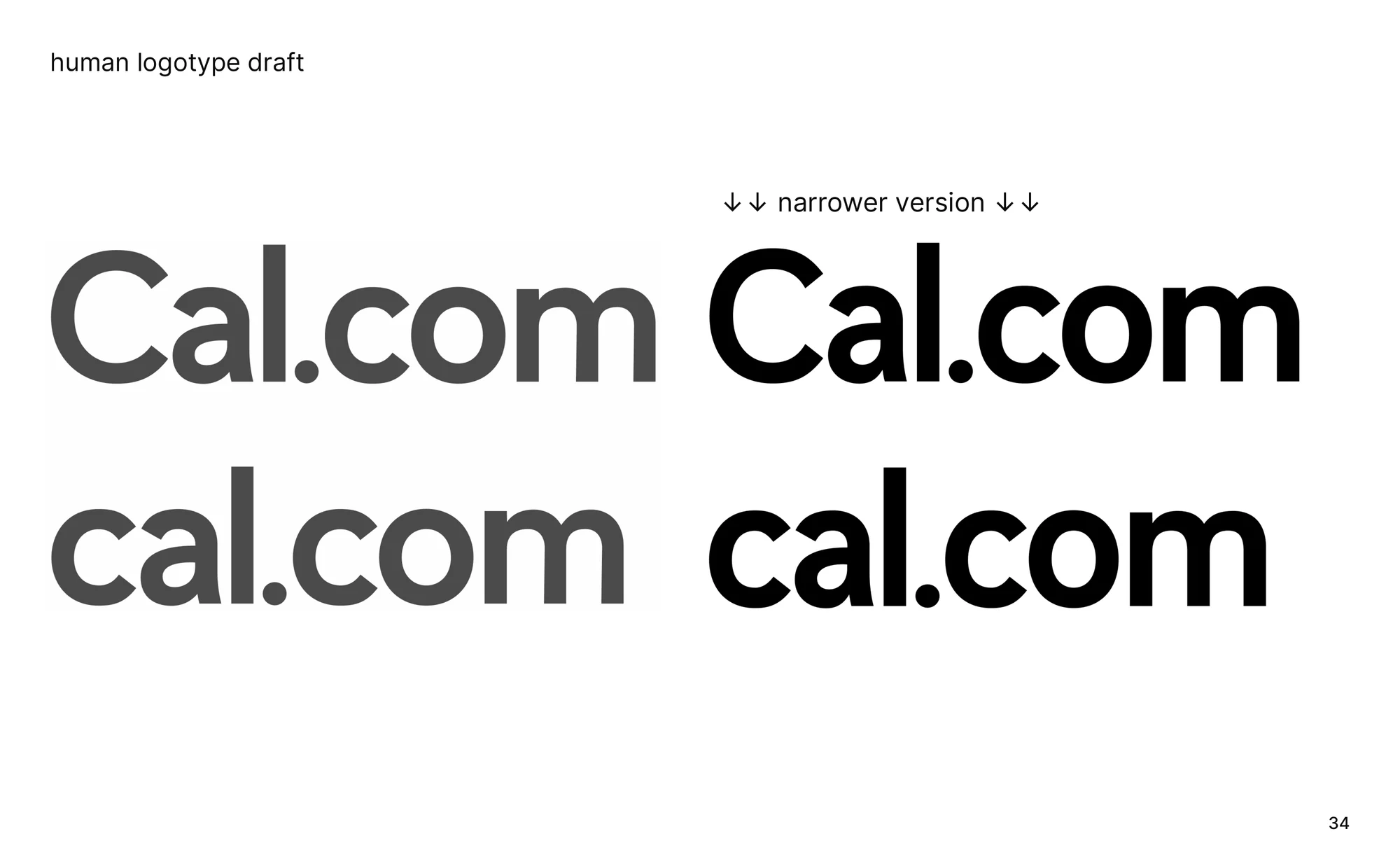
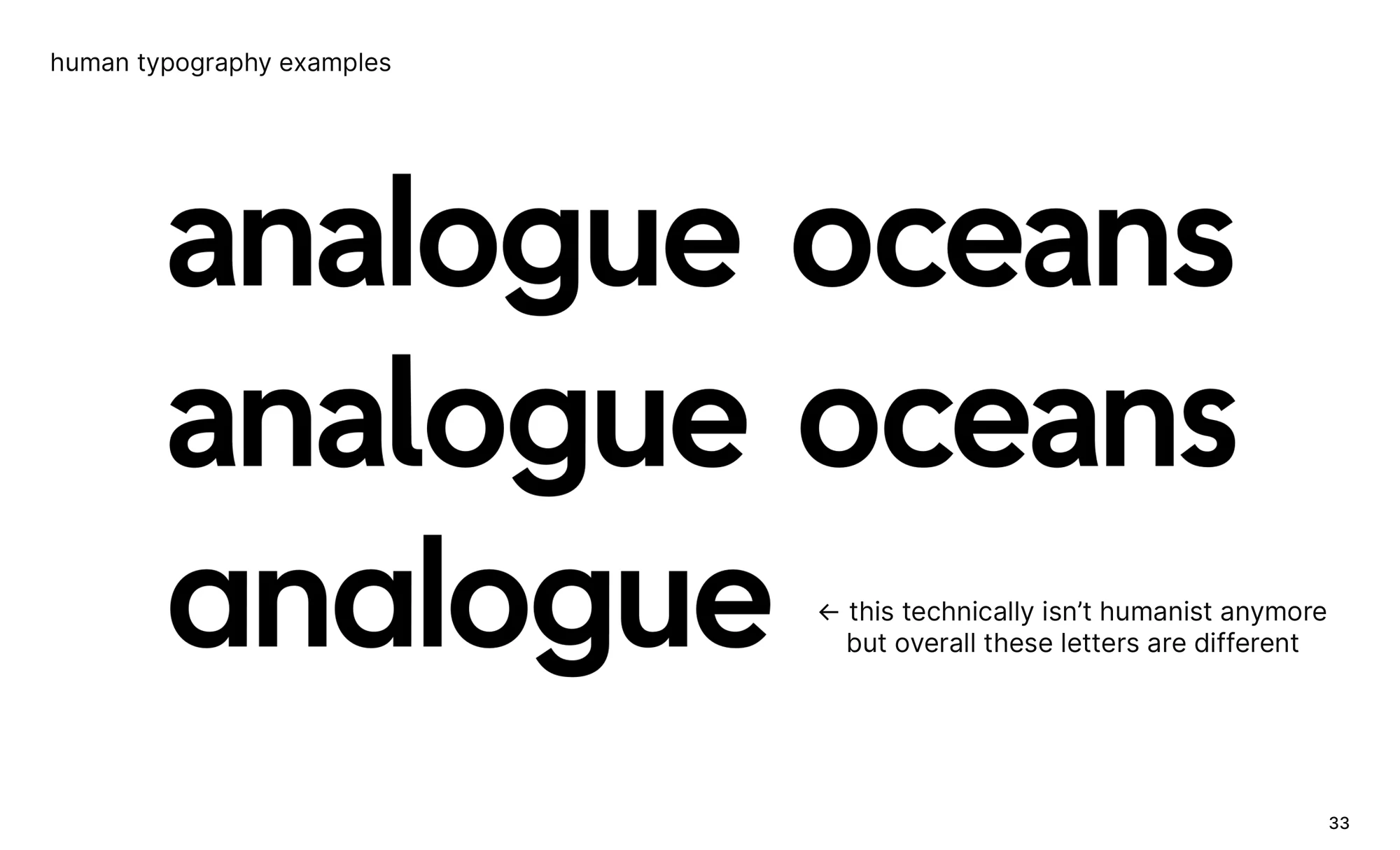
The human draft.
The text direction, drawn as a logotype in the same deck. Five years on it is the same family at optical size 10.
The plan was always the family.
Expand this display-only, single-style typeface to an entire family. One slide, and the sentence that ran the next four years.
Try all six axes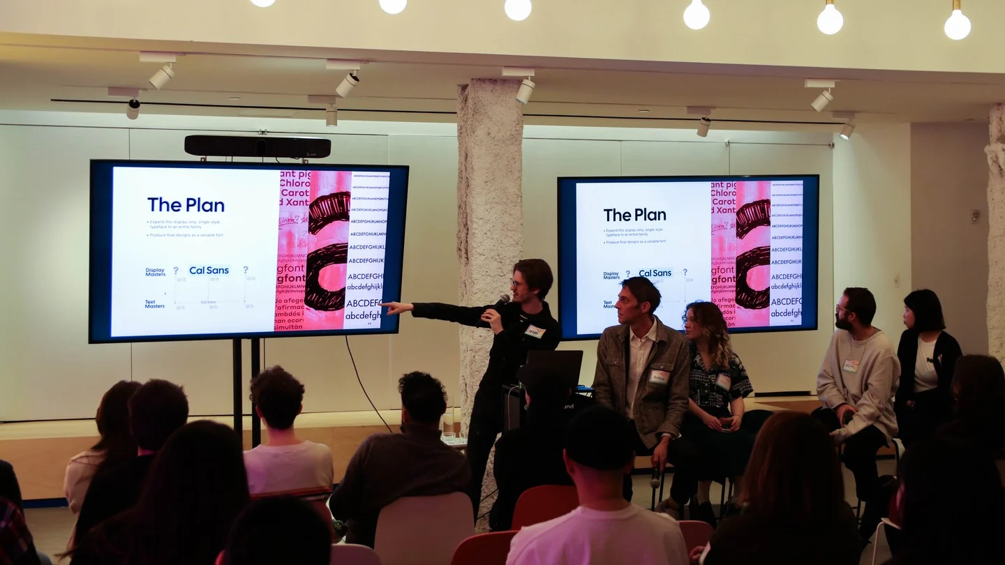
May 2022, the proposal for expansion
2026, the file
Cal v2GEOM25ital0opsz10SHRP0wght400YTAS1440
Cal v2GEOM25ital1opsz10SHRP0wght400YTAS1440
Cal v2GEOM25ital0opsz10SHRP0wght700YTAS1440
Cal v2GEOM25ital1opsz10SHRP0wght700YTAS1440
Cal v2GEOM25ital0opsz45SHRP0wght400YTAS1440
Cal v2GEOM25ital1opsz45SHRP0wght400YTAS1440
Cal v2GEOM25ital0opsz45SHRP0wght700YTAS1440
Cal v2GEOM25ital1opsz45SHRP0wght700YTAS1440
Cal v2GEOM100ital0opsz45SHRP0wght400YTAS1440virtual
Cal v2GEOM25ital0opsz45SHRP0wght400YTAS1600virtual
Cal v2GEOM25ital0opsz8SHRP0wght400YTAS1440semi-virtual
Cal v2GEOM25ital0opsz45SHRP100wght400YTAS1440virtual
Weight 400 to 700Optical size 10 to 45Roman to ItalicDrag to turn, pinch or scroll to zoom, twist to roll
Four masters became eight. The estimate proposed two display masters and two text masters, pitched as a family in the class of Uber Move, Airbnb Cereal and Pinterest Sans. On client trust it kept growing: Regular and Bold, at optical size 10 and 45, Roman and Italic. Eight drawings of every glyph, and thousands of brace layers between them carrying the geometry axis.
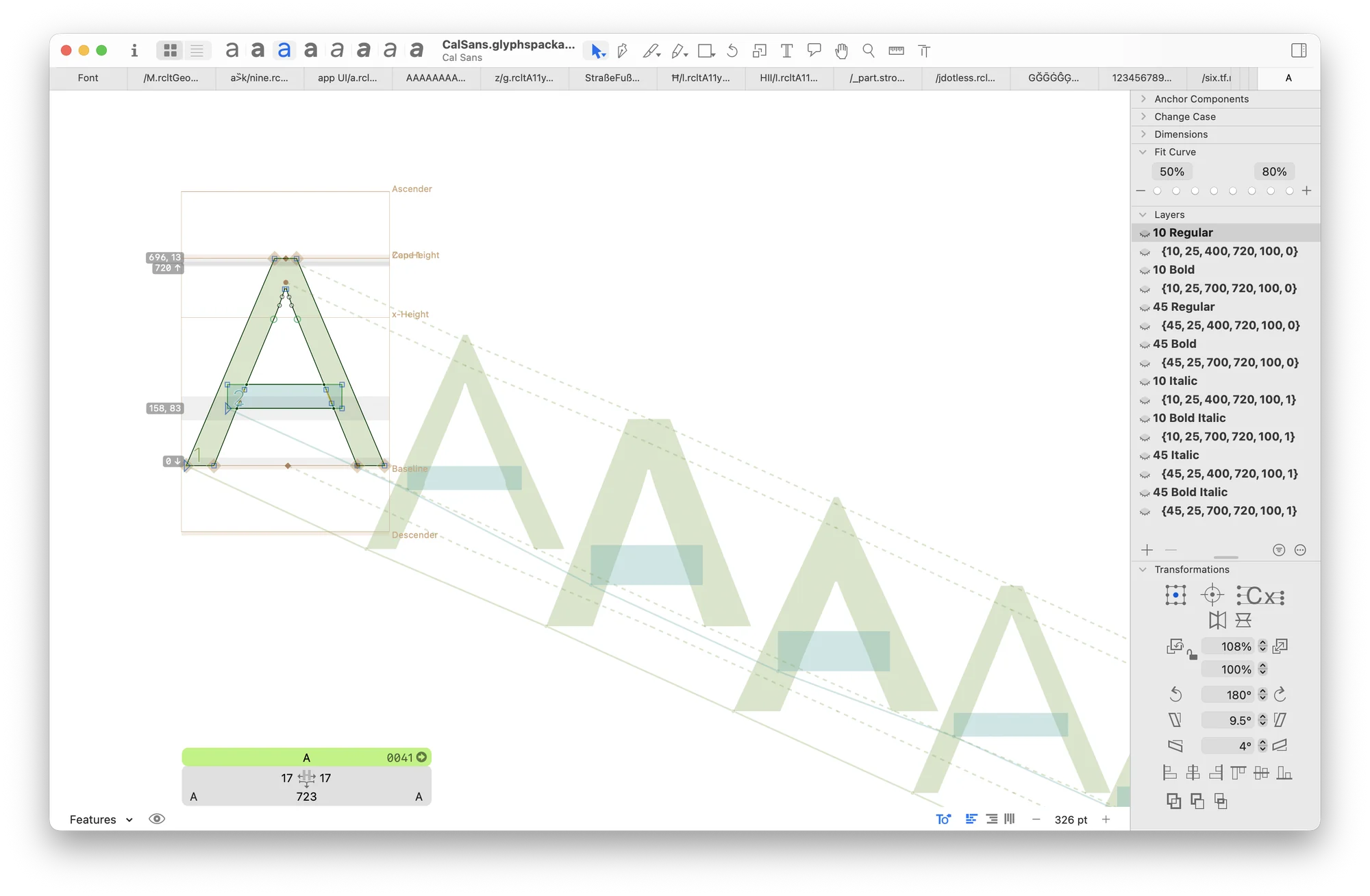
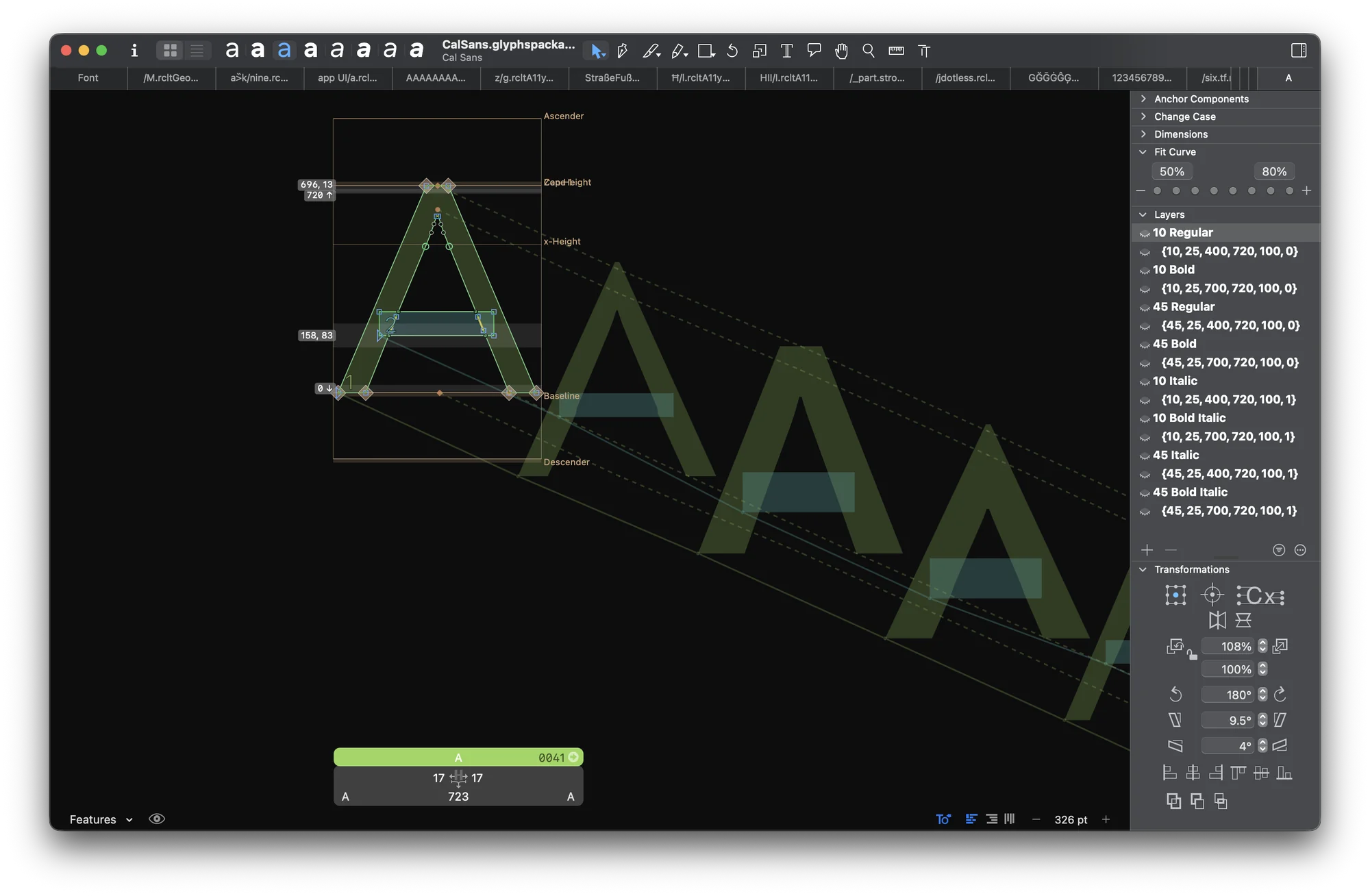
Inside the source.
One A, eight master layers named by their coordinates, and eight brace layers behind them carrying sharpness. Sixteen drawings per glyph is too many to nudge by hand, so the studio learned to script the adjustments across layers and keep the drawing in sync.
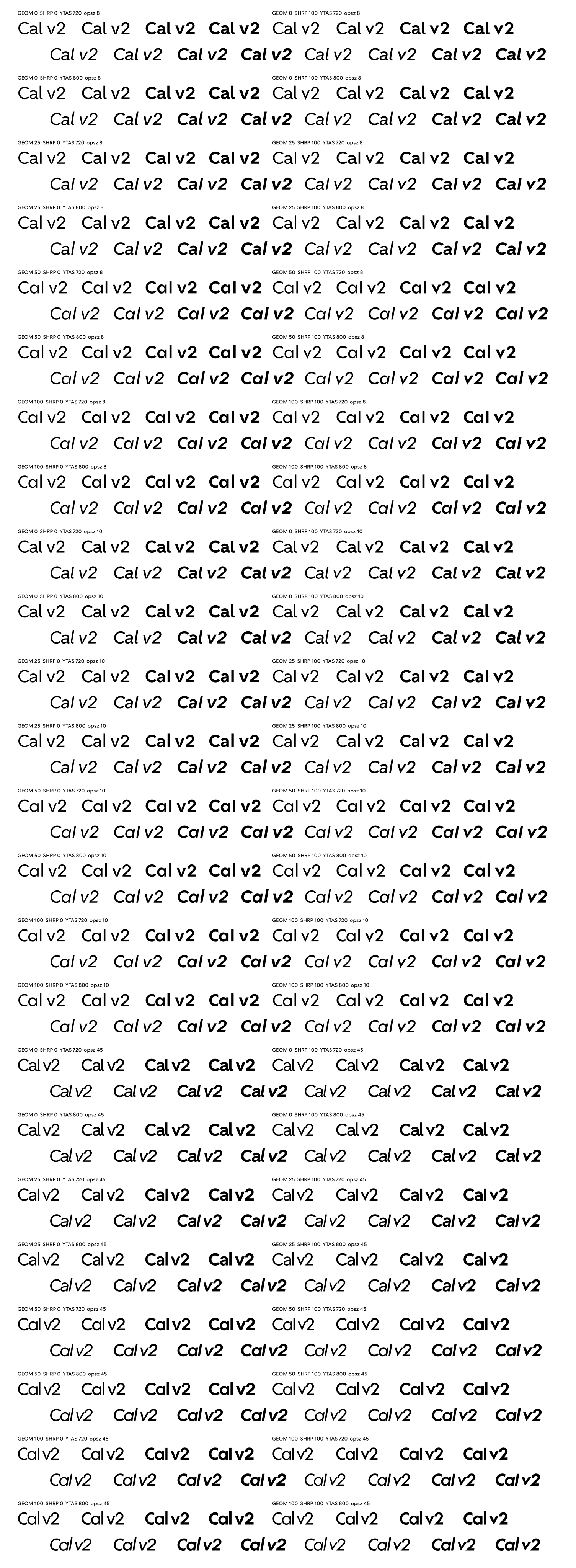
Regular through Bold. 384 statics from one source.
Cal Sans SemiBold became the Bold, and Regular to Bold with italics makes eight. Every letterform, size, height and sharpness multiplies them: 384, built by calbuild from one variable file.
Get the fonts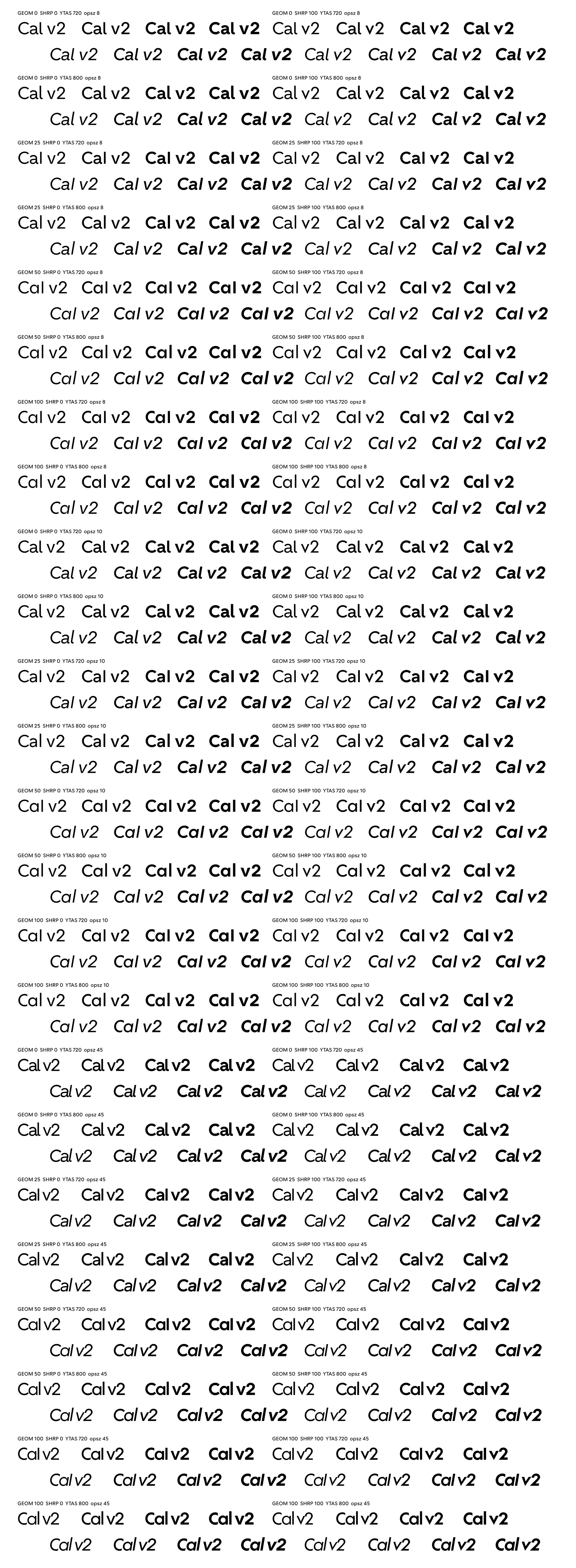
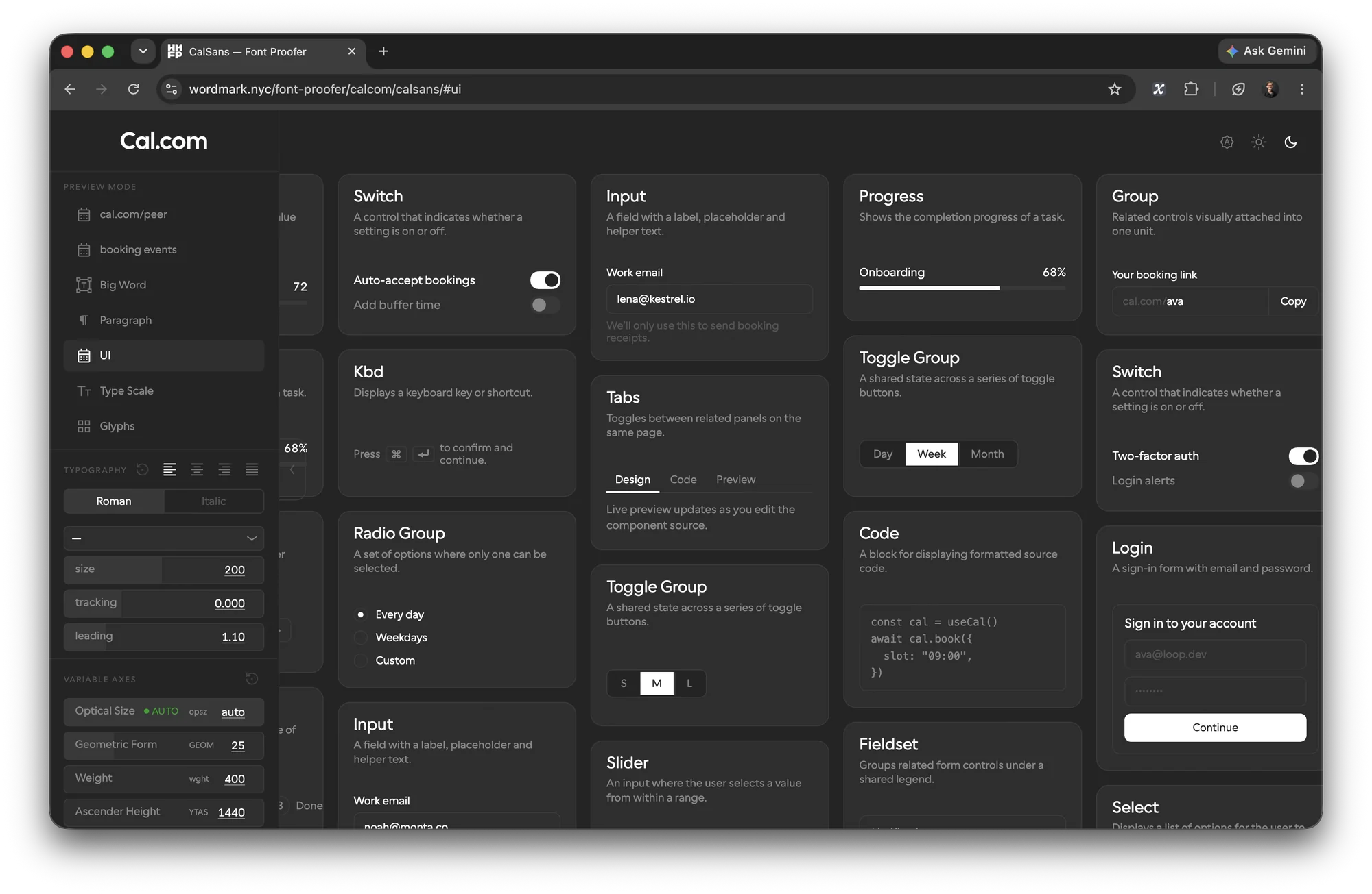
Tools built on the way. Not for want of features, for want of fewer: a proofer with the client’s own UI as its preview tabs and two optical sizes side by side in one paragraph panel, and nothing in the way. Four tools came out of that.
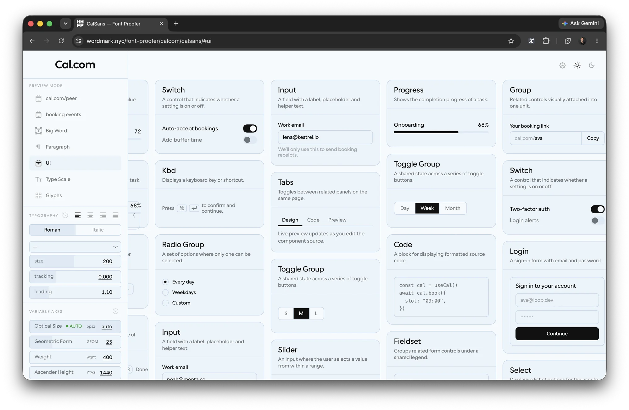
 font-proofer ↗
The font in Cal.com’s real screens as preview tabs: booking pages, the app, the component board, and a paragraph panel that sets two optical sizes side by side.
font-proofer ↗
The font in Cal.com’s real screens as preview tabs: booking pages, the app, the component board, and a paragraph panel that sets two optical sizes side by side.
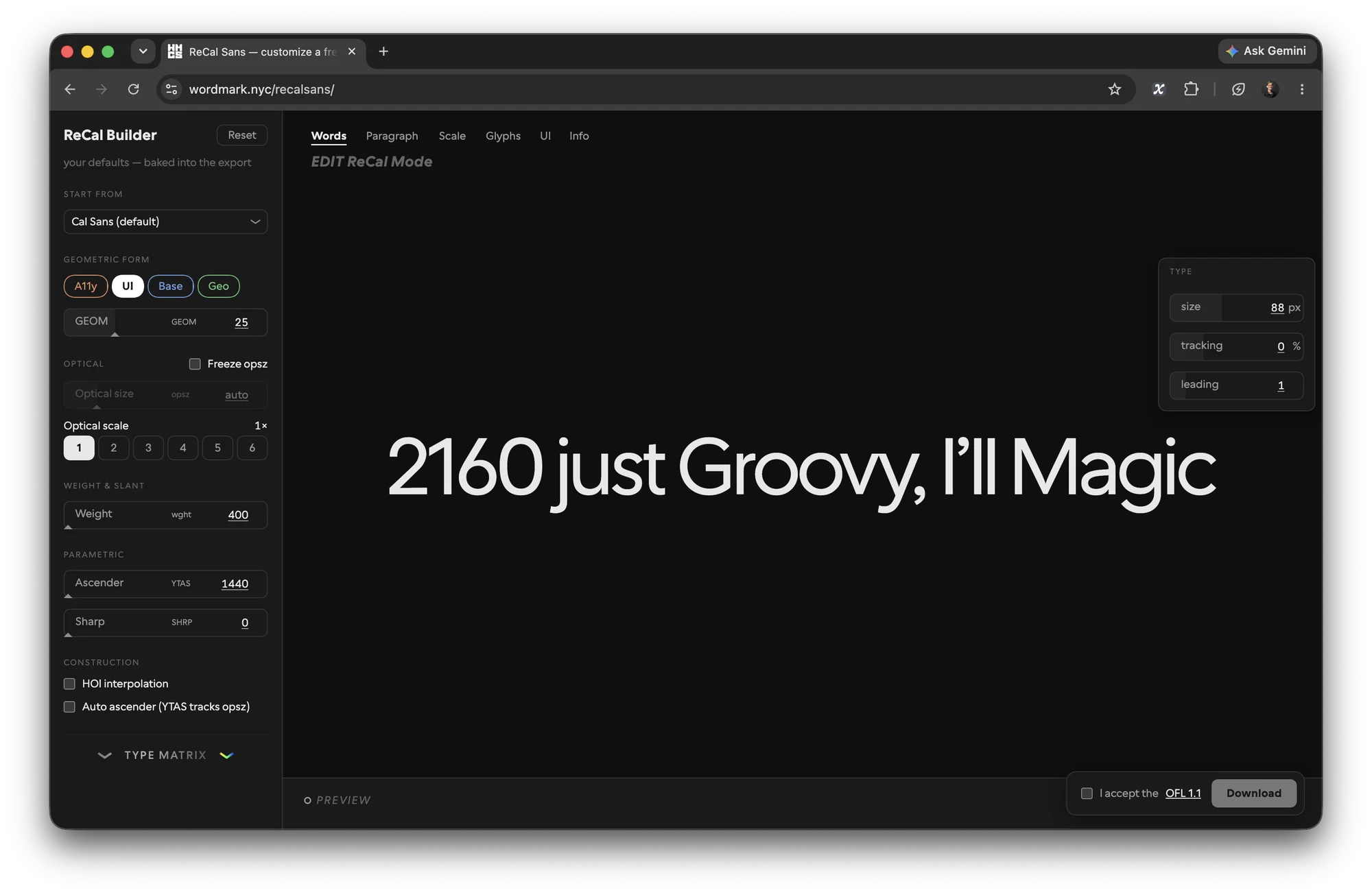 ReCal ↗
Pick the defaults, bake them in, and download your own cut of Cal Sans from the browser. After DJR’s Input downloader and Belleve Invis’s Iosevka.
ReCal ↗
Pick the defaults, bake them in, and download your own cut of Cal Sans from the browser. After DJR’s Input downloader and Belleve Invis’s Iosevka.
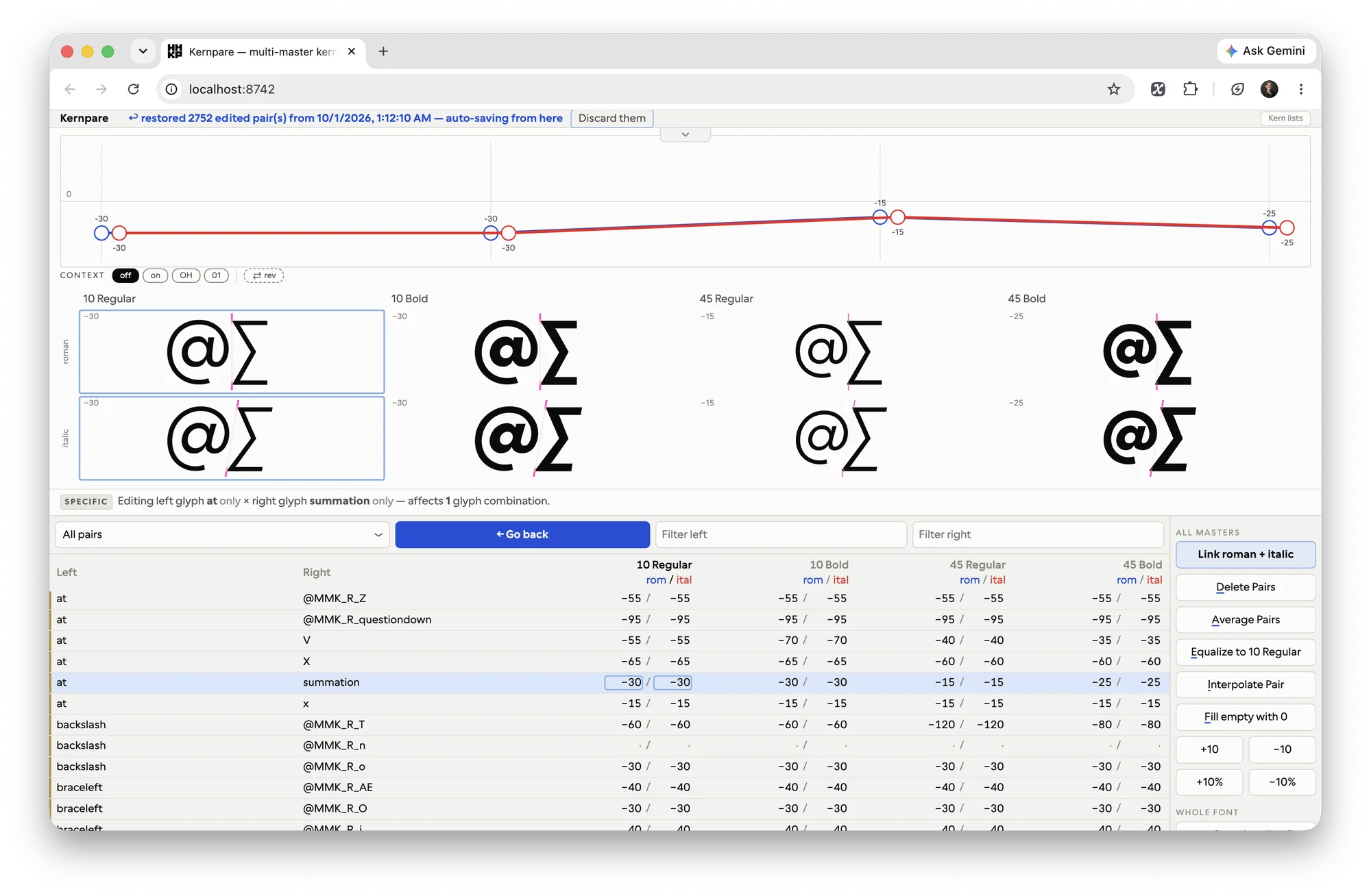
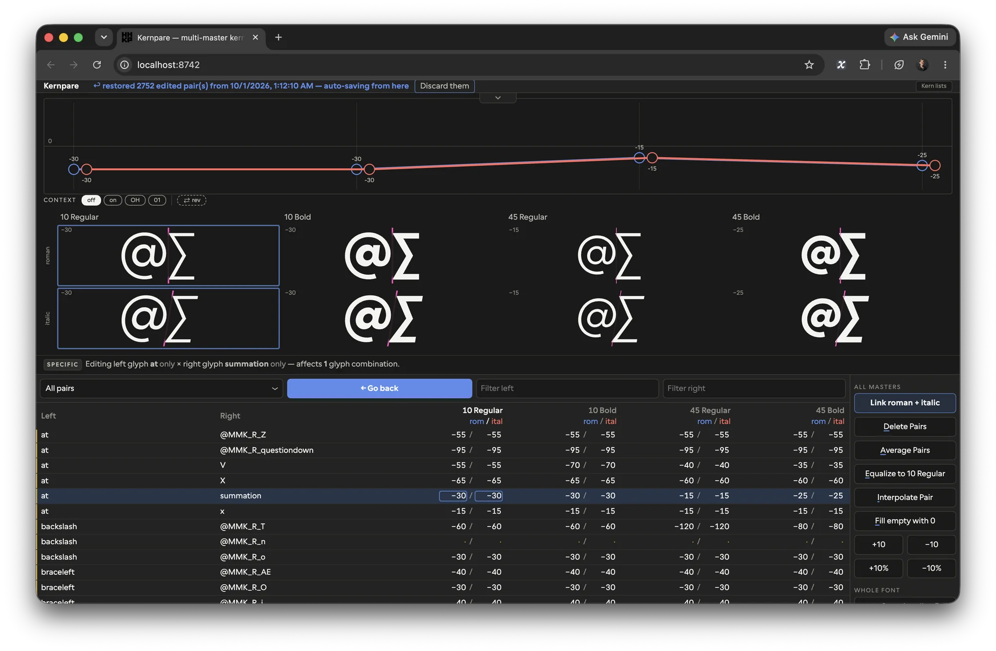 kernpare
Every kerning pair across all eight masters at once, roman and italic optionally linked, with the curve a value takes from text to display. After Adobe’s Kernalytics, MIT.
kernpare
Every kerning pair across all eight masters at once, roman and italic optionally linked, with the curve a value takes from text to display. After Adobe’s Kernalytics, MIT.
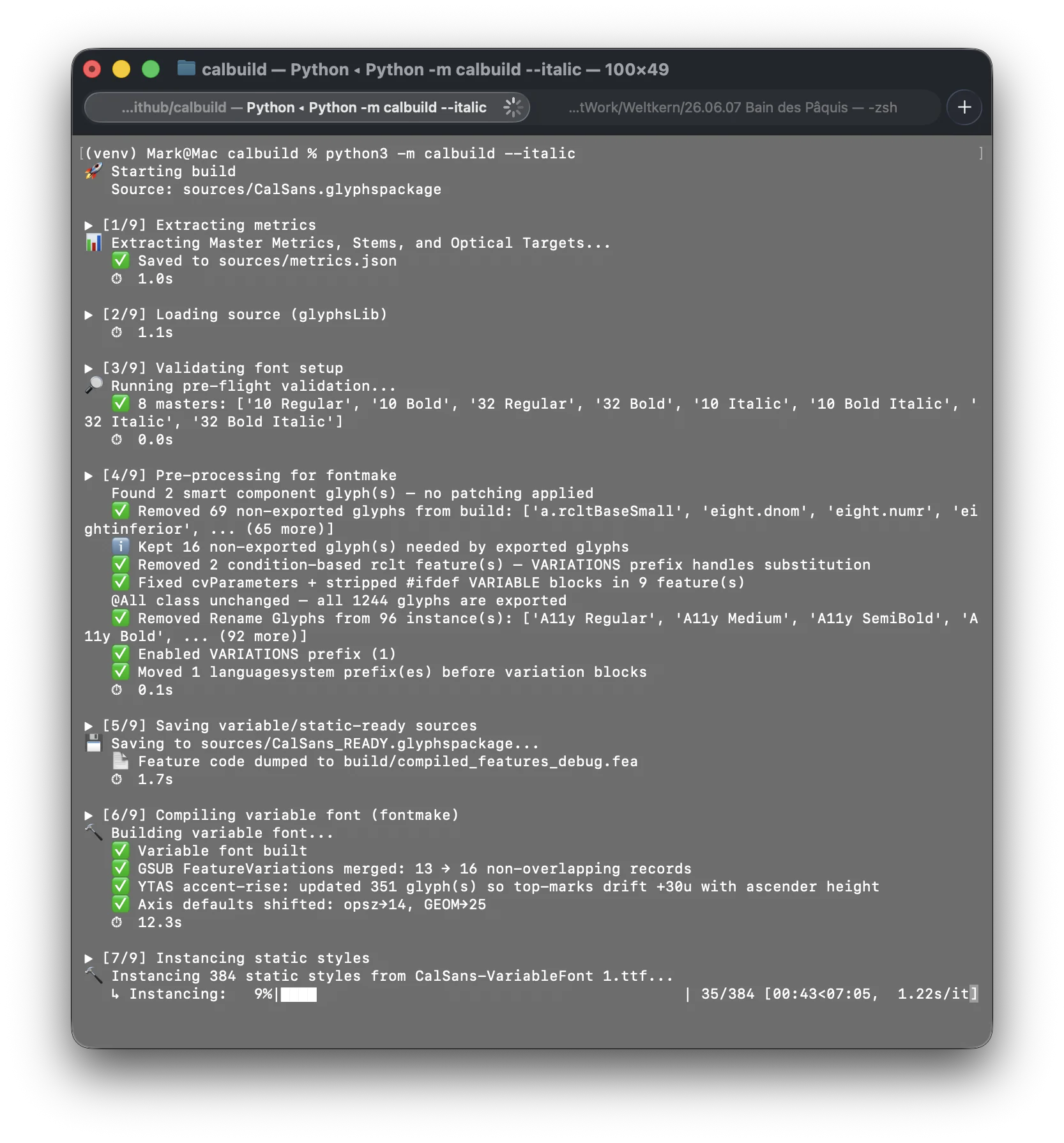 calbuild ↗
The build, start to finish: metrics, validation, the variable font, the statics, the packages for Google Fonts, npm and jsDelivr. In the Cal Sans repo, under scripts.
calbuild ↗
The build, start to finish: metrics, validation, the variable font, the statics, the packages for Google Fonts, npm and jsDelivr. In the Cal Sans repo, under scripts.
From the studio
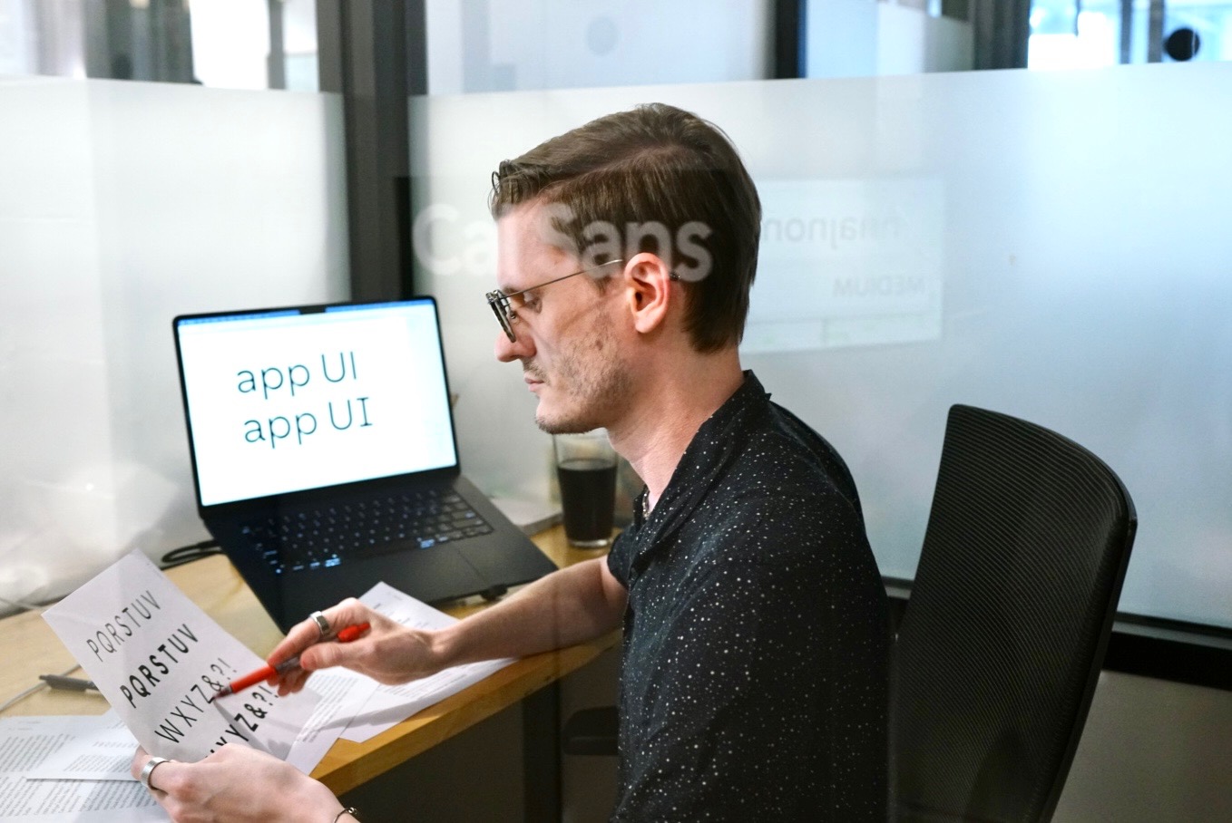
I’m Mark Davis, and I run WORDMARK. The UI cut of Cal Sans was in round one; Cal.com took the headline first.
Five directions were on the table, from Futura in light disguise to a grotesk. Cal.com picked the one that reads as rings.
The other three were worth a shot.
Matter cost about €1,400 a year. Inter cost nothing, and that was the problem; everyone has it.
The pull request to Google Fonts changed the pace. Peer saw the roadmap, asked if it was a UI font, and wanted to talk commercials that day.
Peer’s Cal Sans 2 post hit 60K views and 536 bookmarks in 12 hours, saved faster than it was liked.
“I went to the website and I immediately said, what’s that font? I don’t do that a lot. […] Rather than getting a logo design, they had a font, and they open sourced the font.”
Heading = Cal Sans
Body = Inter
Code = Input Mono
Draw five. Ship one. The rest is already drawn.
One family. Three releases.
2021 · v1.000
Cal Sans
The geometric display weight, with six variants, Futura alternates, and historical ligatures. On Google Fonts.
2025 · v1.600
Cal Sans UI
Text proportions and spacing for product interfaces, variable on weight and GEOM. Shown off by the first cal.com/font page, built from code.
2026 · v2.000
Cal Sans 2
Display and text in one file, six axes, 1,550 glyphs. Installed in coss.ui and the site; on Google Fonts, npm, and jsDelivr.
Try it
Italic
Geometric Form
One weight earned the trust
A startup doesn’t buy a font family, it buys a stronger brand. Cal.com trusted one weight to replace a standard, and every stage since served the brand it built.