A tunable, variable alternative to Inter
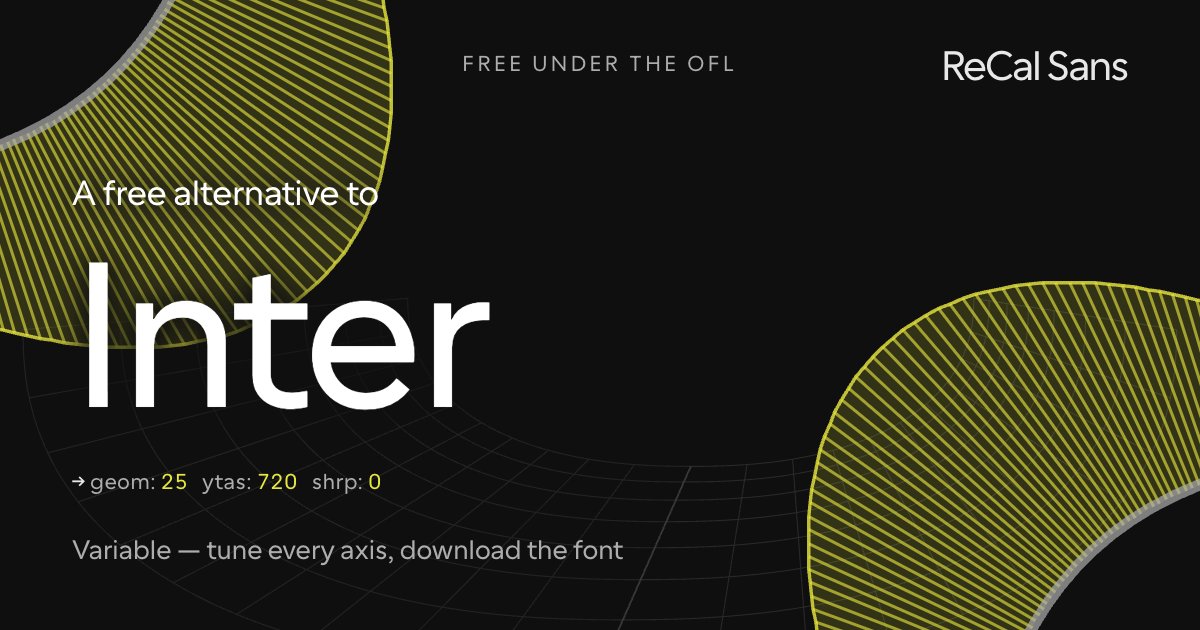
Inter is the modern UI workhorse: a tall x-height screen grotesque with meticulous spacing, variable weight and optical sizing, free under the OFL. If you need neutral, Inter is close to unbeatable — and "free alternative" would be an empty pitch, because Inter costs nothing.
What ReCal Sans adds is range of voice. Its GEOM axis moves the letterforms themselves — from disambiguated, accessibility-first shapes through clean UI forms to circular geometric display — where Inter stays deliberately neutral. Keep the optical sizing you expect, pick the construction you want, and bake it into a static file that ships anywhere.
Customize it above ↑The tell: what gives Inter away
Inter's tell is that it has none, and that is the design. It is drawn to blend — to temper a spicier display face, a loud palette, a busy layout — and it succeeds by refusing a signature. Cal Sans' neutral UI base does the same job, which is why this preset is the plainest of the eight: the mise en place, not the dish. Both take the humanist 6 and 9.
Where ReCal Sans loses
Inter cuts almost every terminal at 90° to its stroke and square to the baseline; the a is one of the few exceptions. Cal Sans holds the perpendicular cut but tilts most terminals off the baseline to open the counterforms. That is the trade: less of Inter's even grey, more room inside the letter where small sizes need it.
Will it drop into a Inter layout?
ReCal Sans was built to be as seamless as possible for the Cal.com team, who pivoted directly off Inter — identical x-height performance and similar, though not identical, copyfit. The brief was functional cooperativeness while still making something new, not a clone with tweaks. It is not an Arial-to-Helvetica metric clone and was never meant to be.
At the same point size Inter feels the same, though the two are not the same: Cal Sans is wider and carries more curved tops, which compensates for a real difference in x-height. Measured on the cap-height-normalized comparison, Inter runs about 10% taller.
What this preset freezes
Baked into the font you download, named as CalSansVF declares them:
ss16— Humanist/Grotesk 6 and 9
Frequently asked
- Inter is already free — why use ReCal Sans instead?
- Because of voice, not cost. Inter is an excellent screen face and it already carries an optical-size axis — what it does not carry is a way out of its own register. ReCal Sans adds a GEOM axis that moves the letterforms from accessibility-optimized through clean UI to geometric display, covering ground Inter deliberately does not.
- How is ReCal Sans different from Inter?
- Inter varies weight, optical size and slant inside one deliberately neutral design. ReCal Sans varies the design itself: GEOM travels from accessibility-optimized shapes through clean UI to geometric display, so a single file can be a UI face on one screen and a display face on the next.
- Can I use ReCal Sans commercially?
- Yes — the SIL Open Font License permits commercial use, embedding and modification. The font is yours to ship.